I saw this image on Facebook:
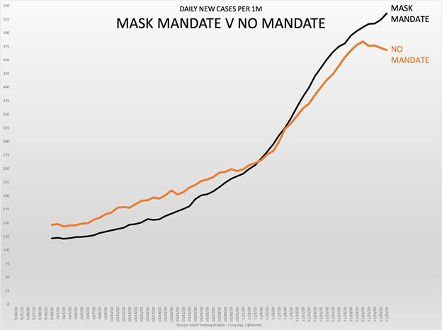
There were a few things I wanted to know from the original graph:
- Actual numbers
- Breakdown by state/territory
- Mask mandates by state (and when they went into effect)
In the graphs below, red values are taken from dates without a mask mandate, blue values are taken from dates with a mask mandate, and grey values are unknown.
Conclusions
Really, I have no clue. These graphs are still very basic, and don't provide a lot context. I just wanted a chance to play with the data myself, and to improve on the original Facebook graph. There are studies that show that mask mandates are effective, and they were analyzed by people much more knowledgable than me: NPR: Mask Mandates Work To Slow Spread Of Coronavirus, Kansas Study Finds